Taking Rhythm Games to a New Level


Rhythm games have been very popular for years, starting out in the arcades, with the dance pads coming to the living rooms. Also im sure you are aware of the popular franchise, Guitar Hero and more recently, Rock Band. These two games focus on the playing being able to play the songs of well known rock bands using popular instruments, the most common being the guitar.
I got given the latest Guitar hero for Christmas and i thoroughly enjoyed it, still play it know, pretending im a rockstar whilst tapping away at a piece of plastic with 5 coloured buttons.

However, now the creators of Rock Band have upped the tempo and have incorporated a 'Pro Mode' for the guitar, drums and keyboard parts of the songs. The one that stands out for me is the guitar. Instead of just having 5 buttons and a strum bar, you get the full 102 threats and six strings:

However, instead of full length strings, you get a button, 1 for each threat. No more pretty colours which you can learn to play well in a few weeks, this will take months of practice to play well. What i like about it is that beginners won't get overwhelmed by tuning and having to develop calluses. This is what put me off learning guitar back in school, or it was the fact i was 14 and dedicate my time to anything, apart form games. Now i could play and learn at the same time. You can even plug it into your pc and use a MIDI sequencer and have a blast.
Of course some people will think that they will pick this up and then be able to play a real guitar well. Not the case, sure you will know the chord placements and what not, but will you be able to hold the threats down properly, know how pinch harmonics work and whamming.
It is a very sturdy stepping stone though, that i think will get a lot of people learning the guitar from this. I'm quite tempted myself to pick on up, even at the £109 price tag.

I think this is a big turning point for rhythm games, and i suspect there will be many to follow.


You Don't Need Fancy Graphics to Have Fun

Quite a will ago i stumbled across a game called Minecraft, because it was mentioned on the team fortress 2 blog. It is certainly an interesting game. For a lot of people the graphics, or should i say, art style, are an interesting choice. I suspect they are as simple as they are is because it is only been worked on by one indie game developer until now.

The purpose of the game is to survive, and build what ever you want. You start with nothing and simply punch the ground or trees to collect blocks of dirt, wood etc. You can then craft items to create others and combine them to make tools, armor and weapons. What i love about this game is the fact that each time you create a new game the level is randomly generated, and can become the up to 8 times the size of the earth, or until your computer runs out of steam. Here is a fly over, showing the random generator at work:
It can produced some amazing scenes even though it is made out of blocks.


I'm quite a fan of indie games, they show promising ideas, unlike many mainstream developers, producing the same first person shooters over and over, just with slightly better graphics.

You can play the free version if you visit www.minecraft.net where you have unlimited blocks and can only build things, if you want to get the most out of it you have to pay, and it has only just entered beta. I reckon in the next 6 months this game will be pretty damn popular.


End of Year 2

Well the final assessment is already upon us, i can't believe how quick time has gone, it only seemed like yesterday i was reading the mortal engines briefs. I've certainly learnt a lot this year, especially the 3d side, mostly from my mistakes. The mortal engines projects played a big part in this. I made a lot of errors within each project, mainly with the texturing. Now i can look back at it and see how bad some parts were. The small projects heather gave us after Christmas were good fun. I think it would be good for everyone if these were set after each major project.
The group project was a major part of the second year. It showed us how things work in the industry and how important certain aspects are. Having good communication skills are vital, as well as consistency and naming conventions. I certainly enjoyed the group project and look forward to seeing what next years second years create. Even though the group project was fun, i still think i'll work on my own for the 3rd year major project. I like to have full control over what is happening, plus i won't have to worry about people not turning up or doing the work etc. Not that this really happened in our group, but i did notice there were one or two people in some groups like this.
The 3rd year major projects have really inspired me to get to grips with unreal, as some of the results are fantastic, something i am really looking forward to using in the 3rd year.
I'm starting to become more confident now with my drawing, i don't hesitate as much as i used to, i just get on with it, no matter how difficult the scene is. The better the challenge the more you learn i've noticed. The same applies to my life drawing, i feel i am improving steadily, Chris mentioned about getting life drawing every day next year which would be great.
I think the most important thing i have learned from this year is how important time management is. You would be surprised at how many hour you waste each day, and they add up, to a lot. One thing i defiantly need to do for the third is is create my own work timetable, and ensure i stick to it. Otherwise, things could go horrible wrong...

The Group Project At An End

Well, the group project is pretty much at an end now and its been quite an interesting experience. It is a great way to see what things will be like in the industry. The importance of scheduling, naming conventions and more. Personally im really pleased with the way our level turned out and also with the group i'm in. We all got on well and the weren't any bad moments or bitching etc. The use of a forum worked really well, it allowed everyone to upload their work and people download it from anywhere. We also used a blog to keep track of the level's progress and add any concerns or important announces.
From the feedback we got from formative assessment we all agreed to churn out a decent amount of small assets which could be placed around the level, as it felt fairly empty and didn't really have and signs of human activity. Writing on the walls in conjunction with the assets made the level believable. We also managed to get a few sounds and animations in the level.
From the start we all agreed we wanted to use lighting to create the atmosphere. The use of light fog and harsh lighting worked well. You can see enough to know where you are going and to see the assets, but not too much so you can see the whole room. This meant that the person moving around wouldn't get overwhelmed by the details and miss small parts. The lighting meant that you would have to move about at a slow rate, ensuring that you wouldn't miss anything.
Mark did a great job in the unreal department. His experience with UDK really helped us make the most of it, and also meant that we could start creating the level in unreal earlier, due to the fact that no one had to learn it. Obviously we all still had to learn it so we can create our own levels with our assets and textures only, but without the pressure.
I think one of our groups strongest points was that we always were in the labs when we were supposed to be, and at any time when a meeting was arranged. This meant that we would see the progression of peoples work and the level several times a week, ensuring that everything was going to plan and that there were no major issues. Communication overall was very good.
I think the main problem we had was consistency with the textures. Seeing as pretty much everything would have some form of corrosion, dirt and grime, getting the amount right was difficult. We made several mood boards which had the textures we were aiming for, as well as some colour swatches, which helped.
Overall, i feel our group project went well. Communication was good and motivation was high. This enabled us to achieve want we had planned at the start. The group project has taught me a lot and has been a valuable experience. I think everyone deserves a pat on the back.

You Require More Polygons

The amount of polygons, or tris, whatever you prefer, is constantly increasing every year. Seeing as computer technology gets outdated almost every six months its pretty easy to see why. Personally, i feel we are at a peak of graphic realism right now, almost every big game will have the same graphical quality as the others, none really standing out from the rest, although some will be better in some areas depending on the genre of the game.
One game that will raise the bar when it is finally released will be Gran Turismo 5. GT has always been know for its high level of details with the vehicles and now it almost looks perfect, the cars at least :
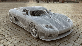
I read an article recently in a PS3 magazine on the statistics of GT5, and some of the cars consist of up to 500,000 polygons, compared to the original GT, which had 300 polygons for each car. Generally though, the majority of the cars will be about 100,000 polys. Below is a car not created for GT5 but built to the standards and constraints:


Pretty crazy. The reflections are brilliant. What amazes me is that the PS3 will run the game with 16 cars with this many polys and real time rendering at 60fps, which i doubt any computer could do comfortably. In a year or 2 probably.
Of course this doesnt mean you dont have to worry about low poly modelling, this is still a key factor in games, manly to do with levels of detail, the further away you get the less detailed it will be. I think GT4 had 5 levels of detail.
Oh, its a good job the ps3 uses bluray because at the moment GT5 is 140GB in size, planned to be released on 3 discs. No wonder its PS3 exclusive, installing it on a PC with dvds would be fun...

Character Design

It's always a challenge to create a decent, original character nowadays. Personally, i dont enjoy it that much and therefore struggle more than most people when it comes to the interesting character projects. Anyway, more and more games are becoming more realistic each year and so are the characters, at least in most games. Some are quite simply ridiculous. The main culprit for such crazy characters are generally beat em ups, which tend to consist of guys with muscles bigger than their heads and women with oversized breasts and some pieces of cloth or leather as an excuse for an outfit. Soul Calibur 4 thrives in this area of 'art' for example:

I guess some people who have never seen a woman in real life may find that attractive. Even Realistic games such as Resident Evil 5 go wrong sometimes:


Hurr, my arms are bigger than my entire head. It must be a struggle to find tops that don't rip every time to put them on. Luckily there are some game developers out their who know how to create decent, realistic game characters. The main one that pops into my head is Valve, with Half Life 2. Take Alyx Vance for example:

Nothing over the top, just someone who you would expect to see in real life, unlike the woman above. I suspect one of the main reason Half Life has such good characters is the fact that a lot of them are based on real life people, not made up. The link below shows some examples:
If anyone asks you, i can't seem to make a decent character, building or vehicle, just tell them that all the inspiration you need it right outside.

The Group Project

Well its been a fair few weeks since we started the group project and time is flying by, it only seemed like yesterday we were discussing what to do. Personally, I'm very happy with the progress we are making and should make the deadline without much stress. We are currently on the stage of texturing the environment, most of which has been completed in a week. We now need to make sure that the amount of grime and dirt is consistent, as well as the colours used. The colours should be ok as we are all using a custom swatch made from several reference photos. Next we will be doing some beta testing to make sure the geometry is accurate and ensuring the textures are correct and have no major errors which stand out, such as obvious repeating textures. Once this is done any normals and specular need to be created. Even though we have been ahead of schedule for most of it i think the planing could have been a bit better, mainly the tasks given to each person, as a few things have been made twice by separate people. Nothing major, just small things such as lights and chairs.
Anyway, here are a few shots of the current textures (the composites in the view ports wont look as crisp by the way):