You Require More Polygons

The amount of polygons, or tris, whatever you prefer, is constantly increasing every year. Seeing as computer technology gets outdated almost every six months its pretty easy to see why. Personally, i feel we are at a peak of graphic realism right now, almost every big game will have the same graphical quality as the others, none really standing out from the rest, although some will be better in some areas depending on the genre of the game.
One game that will raise the bar when it is finally released will be Gran Turismo 5. GT has always been know for its high level of details with the vehicles and now it almost looks perfect, the cars at least :
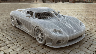
I read an article recently in a PS3 magazine on the statistics of GT5, and some of the cars consist of up to 500,000 polygons, compared to the original GT, which had 300 polygons for each car. Generally though, the majority of the cars will be about 100,000 polys. Below is a car not created for GT5 but built to the standards and constraints:


Pretty crazy. The reflections are brilliant. What amazes me is that the PS3 will run the game with 16 cars with this many polys and real time rendering at 60fps, which i doubt any computer could do comfortably. In a year or 2 probably.
Of course this doesnt mean you dont have to worry about low poly modelling, this is still a key factor in games, manly to do with levels of detail, the further away you get the less detailed it will be. I think GT4 had 5 levels of detail.
Oh, its a good job the ps3 uses bluray because at the moment GT5 is 140GB in size, planned to be released on 3 discs. No wonder its PS3 exclusive, installing it on a PC with dvds would be fun...

Character Design

It's always a challenge to create a decent, original character nowadays. Personally, i dont enjoy it that much and therefore struggle more than most people when it comes to the interesting character projects. Anyway, more and more games are becoming more realistic each year and so are the characters, at least in most games. Some are quite simply ridiculous. The main culprit for such crazy characters are generally beat em ups, which tend to consist of guys with muscles bigger than their heads and women with oversized breasts and some pieces of cloth or leather as an excuse for an outfit. Soul Calibur 4 thrives in this area of 'art' for example:

I guess some people who have never seen a woman in real life may find that attractive. Even Realistic games such as Resident Evil 5 go wrong sometimes:


Hurr, my arms are bigger than my entire head. It must be a struggle to find tops that don't rip every time to put them on. Luckily there are some game developers out their who know how to create decent, realistic game characters. The main one that pops into my head is Valve, with Half Life 2. Take Alyx Vance for example:

Nothing over the top, just someone who you would expect to see in real life, unlike the woman above. I suspect one of the main reason Half Life has such good characters is the fact that a lot of them are based on real life people, not made up. The link below shows some examples:
If anyone asks you, i can't seem to make a decent character, building or vehicle, just tell them that all the inspiration you need it right outside.

The Group Project

Well its been a fair few weeks since we started the group project and time is flying by, it only seemed like yesterday we were discussing what to do. Personally, I'm very happy with the progress we are making and should make the deadline without much stress. We are currently on the stage of texturing the environment, most of which has been completed in a week. We now need to make sure that the amount of grime and dirt is consistent, as well as the colours used. The colours should be ok as we are all using a custom swatch made from several reference photos. Next we will be doing some beta testing to make sure the geometry is accurate and ensuring the textures are correct and have no major errors which stand out, such as obvious repeating textures. Once this is done any normals and specular need to be created. Even though we have been ahead of schedule for most of it i think the planing could have been a bit better, mainly the tasks given to each person, as a few things have been made twice by separate people. Nothing major, just small things such as lights and chairs.
Anyway, here are a few shots of the current textures (the composites in the view ports wont look as crisp by the way):


Desaturated

A few days ago i was sat at the window in subway staring out into the street when it occurred to me at how bland most people dress. Almost everyone will be in clothes that consist of greys, browns and blues. You really don't see that many people in bright and bold colours. It may be their personal taste or simply because they don't want to stand out like a sore thumb.
Its the same with most environments we live in. Looking down a street all you will see are tones of grey and brown, maybe a hint of orange or yellow. I guess it means everything looks consistant and not having buildings that look outrageous. Then again, that would make a trip to the shop more interesting.
Now that games are becoming more realistic the same is happening to most first person shooters. Games like Killzone 2 and the CoD:MW series. In Killzone 2 you can't even make out what's going on half the time because its so bloody dark. At least the recent release of Battlefield Bad Company 2 has given hope, the jungle maps are very pleasing to look at, full of vibrant colours.

This game is great by the way, if you are a fan of modern shooters then you'll love it. It's always satisfying taking out a sniper by bring down the entire building he is camping in.